Satellite data isn’t about generating maps; it’s about building a predictive intelligence engine that saves time and precisely targets inputs.
- Satellites detect crop stress by measuring near-infrared light, revealing problems long before they are visible to the human eye.
- Fusing free optical (Sentinel-2) with cloud-penetrating radar (Sentinel-1) data provides an uninterrupted view of crop health, eliminating weather-related blind spots.
Recommendation: Begin by using several years of free historical imagery to create stable productivity zones for your fields. This is the foundational step for all effective variable-rate applications.
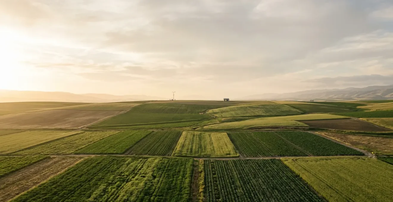
As a manager of a large arable operation, your most limited resource is time. The challenge isn’t just farming the land; it’s knowing precisely where to focus your attention. Traditional crop walking is essential but inefficient at scale. You can walk past a brewing disease outbreak for days, even weeks, before symptoms become visible. The conventional wisdom suggests using satellite imagery, often pointing to basic NDVI maps as the solution. While helpful, these maps are frequently just “pretty pictures” that confirm what you already suspected, arriving too late to inform proactive decisions.
But what if the true power of remote sensing wasn’t in creating reactive snapshots, but in building a proactive intelligence system? The key isn’t just to look at a single image, but to analyze the trend, fuse different data types, and translate subtle signals into actionable alerts. This approach moves you from being a data consumer to an intelligence operator. It’s about leveraging technology to not only see the present health of a crop but to predict its future, spotting the faint signature of stress weeks before it impacts yield.
This article will guide you through the strategic framework for transforming free satellite data into a time-saving, decision-making engine. We will deconstruct the science, provide a practical workflow for accessing the data, and show you how to overcome common limitations like cloud cover. The goal is to equip you with a system that tells you exactly where to walk and when to act.
To navigate this complex but powerful topic, this guide is structured to build your expertise step by step. Below is a summary of the key areas we will cover, from the underlying science to practical, cost-effective implementation.
Summary: From Satellite Data to Actionable Agronomic Intelligence
- Why NDVI Maps Show Crop Stress Before the Human Eye Can See It?
- How to Use Sentinel-2 Imagery for Free to Monitor Crop Biomass?
- FieldView or crop.zone: Which Platform Offers Better Insights for UK Crops?
- The Cloud Cover Limitation That Can Mislead Your Nitrogen Decisions
- When to Spray: Using Biomass Maps to Target High-Risk Lush Canopies
- How to Adjust T1 and T2 Sprays When Growing Resistant Blends?
- How to Start Variable Rate Seeding Using Free Satellite Data?
- Is AgTech Investment Viable for Arable Farms Under 300 Acres?
Why NDVI Maps Show Crop Stress Before the Human Eye Can See It?
The predictive power of satellite imagery lies in its ability to see beyond the visible spectrum. Human eyes are sensitive to green light, which healthy plants reflect. However, the first sign of physiological stress—whether from disease, nutrient deficiency, or water scarcity—is a breakdown in a plant’s internal cell structure, specifically the spongy mesophyll layer. This change dramatically alters how the plant reflects near-infrared (NIR) light, which is invisible to us.
A healthy, vigorous plant canopy absorbs most visible red light for photosynthesis and reflects a large amount of NIR light. As a plant becomes stressed, its photosynthetic capacity decreases, leading to less red light absorption and more reflection. Simultaneously, the collapsing cell structure causes it to reflect less NIR light. The Normalized Difference Vegetation Index (NDVI) is a simple but powerful calculation that quantifies this relationship. It compares the reflectance of red light to NIR light, generating a value between -1 and +1, where higher values indicate a denser, healthier canopy.
This is why an NDVI map will show a drop in values long before you can see any yellowing or lesions in the field. The satellite is detecting the very first sub-lethal cellular response to stress. This early warning signal is the cornerstone of a proactive management system. Furthermore, modern analysis can amplify this advantage; research shows that AI-based disease detection systems can achieve up to 98% accuracy by interpreting these subtle spectral changes, far surpassing what is possible with the naked eye alone.
How to Use Sentinel-2 Imagery for Free to Monitor Crop Biomass?
Building an intelligence engine doesn’t require a significant capital outlay. The European Space Agency’s (ESA) Copernicus program provides a wealth of high-quality, free-to-use data through its Sentinel satellite constellation. For agricultural purposes, Sentinel-2 is the primary workhorse. It is a pair of satellites that capture multispectral imagery—including the crucial red and NIR bands—at a 10-meter spatial resolution.
This resolution is fine enough to identify significant in-field variation for most broadacre crops. More importantly, the Sentinel-2 constellation offers a 5-day global revisit frequency at the equator (and more frequently at higher latitudes), enabling you to build a time-series analysis of your crop’s development. This consistent, repeating measurement is what transforms static images into a dynamic monitoring system, allowing you to track biomass accumulation, spot deviations from the norm, and pinpoint the exact moment a specific zone begins to underperform.
Accessing this data has become increasingly straightforward. You no longer need to be a GIS expert to download and process terabytes of information. Several web-based platforms provide user-friendly interfaces to view, analyze, and even export Sentinel-2 data for your specific fields. These tools handle the complex atmospheric corrections and allow you to apply indices like NDVI with a few clicks.
Your Action Plan: Accessing Free Sentinel-2 Crop Data
- Define Area of Interest (AOI): Access a platform like EOSDA LandViewer. Search for your farm’s location and draw or upload your field boundaries to create your AOI.
- Filter Imagery: Filter the available Sentinel-2 scenes by date, ensuring you select images with low cloud cover (e.g., under 20%) to get clean data.
- Select a Scene: Review the filtered results from your desired time frame and choose the clearest, most relevant image for your analysis.
- Apply Indices & Download: Apply vegetation indices like NDVI or NDRE directly in the platform. You can analyze online or download the processed imagery as a GeoTIF or KMZ file for use in other farm management software.
- Set Up Alerts: To enable continuous monitoring, set up notifications to receive an email alert whenever a new, low-cloud image becomes available for your AOI throughout the season.
FieldView or crop.zone: Which Platform Offers Better Insights for UK Crops?
The question of which platform to use is less about a direct comparison between two specific brands—which may serve very different purposes like data integration (FieldView) versus electric weeding (crop.zone)—and more about understanding the different business models for satellite data delivery. As a manager, your choice depends on your operational scale, your need for resolution, and your budget. There are three main types of platforms to consider.
First is the free Sentinel-based model. These platforms leverage the free data from Sentinel-2, providing robust monitoring at a 10m resolution. They are an excellent entry point, offering powerful analytics like multi-year field performance comparisons and zonation tools at little to no cost. Their value lies in cloud-based analytics accessible from any device, making them ideal for farms seeking cost-effective, macro-level insights.
Second is the commercial high-resolution model. Platforms in this category, such as FieldView, often integrate proprietary data from commercial satellite constellations like Planet, which can offer much higher resolutions (e.g., 3-5m). This level of detail is beneficial for identifying smaller-scale issues and is often tightly integrated with machinery for variable rate applications. The cost is typically a per-acre subscription, making it a better fit for larger operations where the return on investment justifies the expense.
The table below breaks down the key differences between these models, providing a framework for deciding which approach best suits your farm’s specific needs. A third, hybrid model, also exists, offering the best of both worlds for those who need occasional high-detail analysis without a full-time subscription, as shown in the following comparative analysis.
| Platform Type | Data Source | Typical Cost Structure | Spatial Resolution | Best Use Case |
|---|---|---|---|---|
| Free Sentinel-based (e.g., EOSDA Crop Monitoring) | Free Sentinel-2 (10m) + Sentinel-1 SAR | Free tier available; paid features for advanced analytics | 10-20m | Farms seeking cost-effective monitoring with cloud-based analytics |
| Commercial High-Res (e.g., FieldView) | Planet constellation (3m) + proprietary data | Subscription per acre or tiered pricing | 3-5m | Larger operations requiring high detail and machinery integration |
| Hybrid Model | Combines free Sentinel + on-demand high-res tasking | Pay-as-you-go for premium imagery | Variable (10m-50cm) | Farms needing occasional high-detail analysis during critical periods |
The Cloud Cover Limitation That Can Mislead Your Nitrogen Decisions
The single greatest weakness of optical satellites like Sentinel-2 is their inability to see through clouds. For regions with frequent overcast weather, this can create significant data gaps, especially during critical growth stages when timely decisions on nitrogen or fungicide applications are paramount. A two-week gap in imagery due to cloud cover can render your monitoring system useless, forcing you back to reactive, blanket applications.
This is where the concept of data fusion becomes critical. The solution is to integrate data from a different type of satellite: one that uses Synthetic Aperture Radar (SAR), such as the ESA’s Sentinel-1. SAR is an active sensor, meaning it sends out its own microwave pulses and measures the reflection. These microwaves penetrate clouds, smoke, and haze, providing a reliable image of the ground regardless of weather conditions. While SAR data doesn’t measure color like optical sensors, it is highly sensitive to the physical structure, density, and water content of the crop canopy.
By correlating the structural information from SAR with the biomass information from optical data during clear-sky days, advanced algorithms can accurately infer crop status even when the field is obscured by clouds. This creates a “gap-free” time series, ensuring you have a continuous pulse on your crop’s development. A 2025 study demonstrated that temporal deep learning models using Sentinel-1 SAR data achieved 85.7% crop classification accuracy, proving the viability of this all-weather approach.
Case Study: CropSAR-2D Fills Cloud Gaps with Radar Data
To address this very issue, the Copernicus Data Space Ecosystem launched a service called CropSAR-2D. This service programmatically fuses Sentinel-1 radar data with Sentinel-2 optical imagery to generate a cloud-free time series at a 5-day resolution. By inferring information from SAR when optical data is obscured by clouds, the service enables continuous crop performance analysis. This empowers farmers to make informed decisions, such as timing nitrogen top-dressings, even during the prolonged cloudy periods common in many key growing seasons, turning a major limitation into a solvable problem.
When to Spray: Using Biomass Maps to Target High-Risk Lush Canopies
Once you have a reliable stream of biomass data, the next step is to translate it into specific, actionable decisions. One of the most powerful applications is in guiding fungicide spray programs. Disease pressure is rarely uniform across a field. Lush, dense areas of the canopy often create a humid microclimate that is more conducive to fungal development (e.g., Septoria in wheat). These are your high-risk zones.
Instead of a blanket application, biomass maps allow for a targeted approach. Areas with consistently high NDVI values represent the parts of the field with the greatest biomass and, therefore, the highest yield potential and the greatest risk of disease. By prioritizing scouting and even variable-rate spraying in these zones, you can protect your biggest assets more effectively. Conversely, thinner areas of the crop may require a less aggressive program, saving on input costs without compromising yield potential in those zones. This is not about cutting rates everywhere, but about reallocating resources to where they will deliver the most return.
This shift from blanket to targeted application is the essence of turning data into action. It transforms the satellite map from a simple picture into a strategic tool for risk management. By focusing inputs on high-potential, high-risk areas, farmers using AI-powered disease prediction systems report a reduction in pesticide use by 20-40%. The industry is moving decisively in this direction, demanding more than just raw information. As Sam Eathington, Chief Science Officer at The Climate Corporation, stated in an article for the Bayer CropScience UK Blog:
The era of pretty pictures – here’s a map or image of your field – those days are done. Farmers want action; what can I do with this, what does it teach me, what should I change in my operation?
– Sam Eathington, Chief Science Officer, Climate Corporation
How to Adjust T1 and T2 Sprays When Growing Resistant Blends?
The use of resistant variety blends is a sophisticated strategy to manage disease pressure, but it doesn’t eliminate the need for fungicides. It complicates the decision-making process. How do you tailor your spray program when different parts of your field have varying levels of genetic resistance? Remote sensing provides an objective layer of data to guide this complex decision.
While the blend itself provides a baseline level of protection, in-season conditions can still lead to localized outbreaks, especially in highly susceptible varieties within the mix or under extreme disease pressure. Your satellite imagery acts as a performance monitor. By tracking NDVI across the season, you can identify if any zones are showing signs of stress despite the genetic resistance. A significant, localized drop in NDVI is a red flag that the disease is overcoming the blend’s defenses in that specific area.
A practical rule of thumb is to establish a baseline NDVI for the healthy crop and set an alert for when zones deviate. For many crops, according to precision agriculture research, an NDVI value below 0.4 often indicates moderate to severe stress. At the T1 and T2 fungicide timings, use the biomass map to adjust your strategy. If high-biomass areas are maintaining a strong, stable NDVI, you might stick to a robust but standard rate. However, if you see NDVI values beginning to decline in specific zones, it’s a clear signal to investigate those areas on foot and potentially increase the rate or use a more powerful curative fungicide to stop the outbreak before it spreads.
How to Start Variable Rate Seeding Using Free Satellite Data?
While in-season monitoring is powerful, the most strategic use of satellite data is to inform decisions before the crop is even planted. Variable Rate Seeding (VRS) is a prime example. The premise is simple: apply more seed in areas with high yield potential and reduce seed rates in areas that consistently underperform. The challenge has always been creating accurate management zones to guide these prescriptions. Free historical satellite data is the perfect tool for this.
A single year’s biomass map can be misleading; it might reflect a temporary anomaly rather than the field’s true underlying potential. The key is to look at the long-term trends. By analyzing 3-5 years of free Sentinel-2 imagery from the same key growth stage (e.g., peak biomass), you can create a “Productivity Zone Map” that reveals the stable, consistent performance patterns of your fields. Areas that are high-yielding year after year are your top-tier zones, while areas that always struggle are your low-potential zones.
This multi-year average smooths out the noise of seasonal weather variations and provides a robust foundation for creating 3 to 5 distinct management zones. This historical performance map is the “why” that should drive your seeding strategy. The process to create these zones is methodical and can be done with many free or low-cost tools:
- Access Historical Data: Use a platform like EOSDA Crop Monitoring or the Copernicus Data Space to access 3-5 years of free Sentinel-2 imagery from a key growth stage.
- Calculate Consistent NDVI: Calculate the NDVI for each year’s imagery at the same phenological stage to ensure a fair, “apples-to-apples” comparison.
- Average the Data: Average the multi-year NDVI values on a pixel-by-pixel basis. This creates a single ‘Productivity Zone Map’ that highlights stable performance patterns.
- Classify into Zones: Use the classification tool in your software to divide the averaged map into 3-5 management zones based on the NDVI values (e.g., Low, Medium, High).
- Validate with Soil Maps: To understand the root cause of performance, overlay your productivity zones with free public soil maps. This can confirm if low-potential zones correspond to sandy soils or other limiting factors.
Key Takeaways
- Satellite monitoring’s true power is detecting invisible near-infrared (NIR) light changes, which signal crop stress weeks before visual symptoms appear.
- Overcome the primary limitation of optical satellites (cloud cover) by fusing free Sentinel-2 optical data with all-weather Sentinel-1 radar (SAR) data for uninterrupted monitoring.
- The most strategic use of satellite data is analyzing 3-5 years of historical imagery to create stable ‘Productivity Zone Maps’, forming the foundation for all variable-rate applications.
Is AgTech Investment Viable for Arable Farms Under 300 Acres?
The perception that agricultural technology is only for large-scale corporate farms is becoming increasingly outdated. While high-end machinery and complex software suites can carry a hefty price tag, the barrier to entry for data-driven agronomy has fallen dramatically. The viability for a smaller operation hinges not on massive capital investment, but on the strategic use of freely available tools.
The entire data foundation of a precision agriculture system—multi-year performance maps, in-season biomass monitoring, and weather-independent radar imagery—can be built using free Sentinel-1 and Sentinel-2 data. As the MDPI Remote Sensing Research Team notes, “Many satellite remote sensing products are free of charge and easy to access, nowadays.” The investment for a farm under 300 acres is therefore not primarily financial, but rather an investment of time to learn and implement a new workflow.
The return on this time investment can be substantial. Even simple actions, like adjusting nitrogen rates based on a productivity map or creating a targeted scouting plan, can lead to significant savings and yield improvements. The principle of variable rate application is often more impactful on smaller or more variable fields, where optimizing every square meter counts. The success of a Brazilian soybean producer using NDVI maps for variable rate fertilizer application shows that these strategies generate a clear ROI by eliminating waste and boosting productivity in high-vigor areas. For a smaller farm, eliminating waste is a direct boost to the bottom line.
To begin building your own predictive system, start by analyzing the historical performance of your fields. This foundational data layer will unlock a new level of precision in your agronomic decisions, turning satellite data from a novelty into a core component of your management strategy.